Project Overview
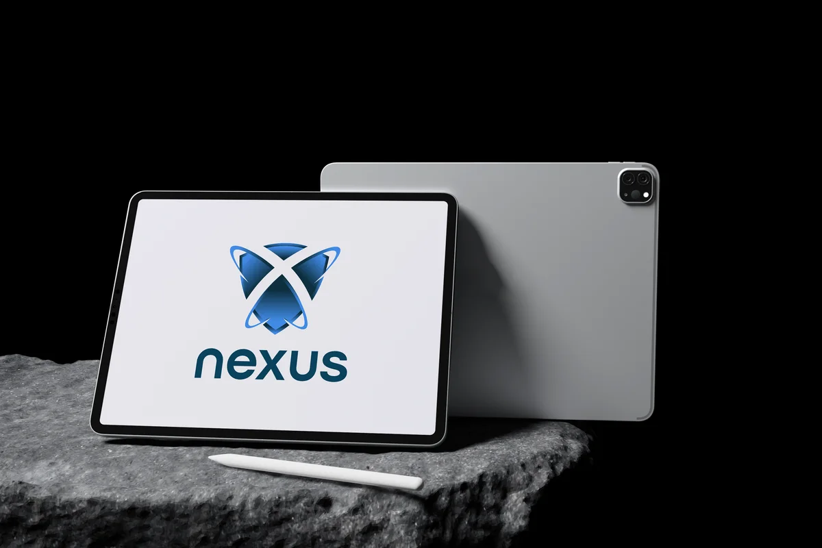
Nexus is a custom software development brand focused on building personalized technological solutions for each client. Their methodology starts with listening — understanding the problem deeply before writing a single line of code. They believe technology should enhance human connections, not replace them, and that software must adapt to the user, not the other way around. We were brought in to create a brand architecture and visual identity that communicates their philosophy: the point where everything connects, anchored in functionality, innovation, and trust.
The Challenge
Nexus had grown through referrals based on engineering quality and their collaborative, listening-first approach. As they scaled, they needed a visual identity that could communicate their values to new clients without relying solely on word of mouth. The brand had to reflect their technical precision, their human-centered methodology, and their promise of building technology that truly serves people.
Our Solution
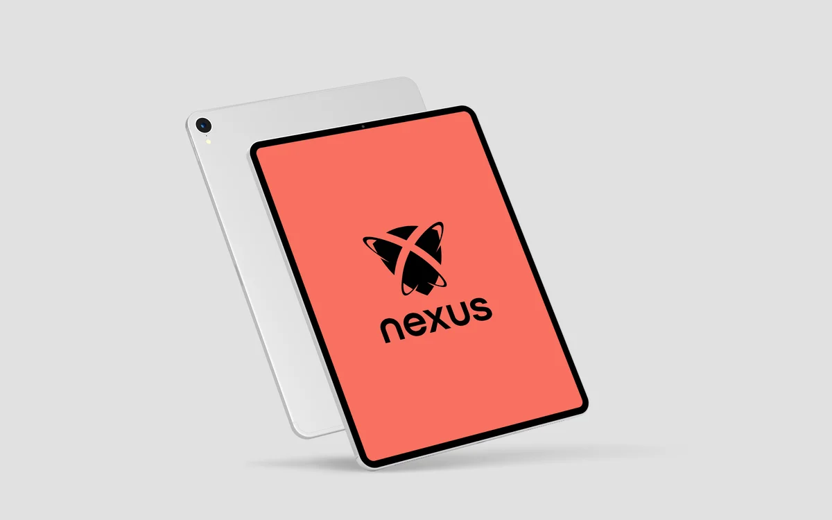
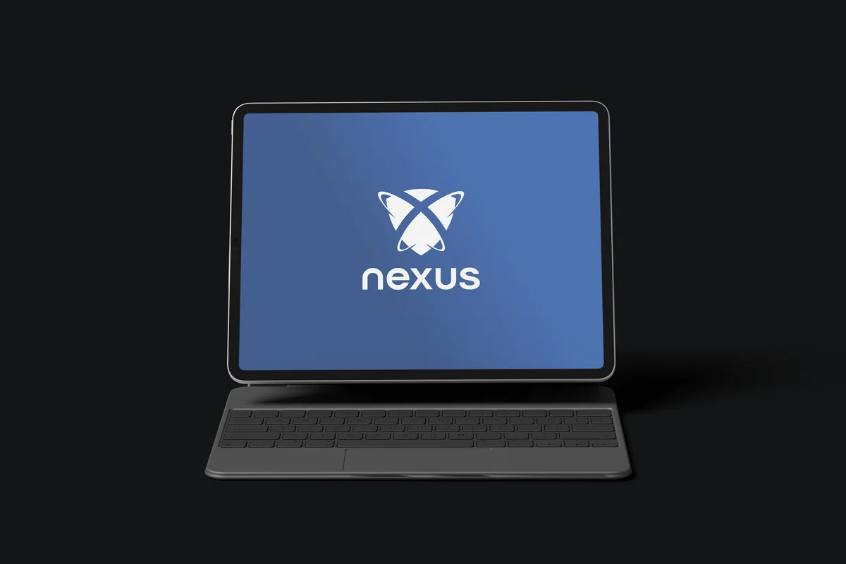
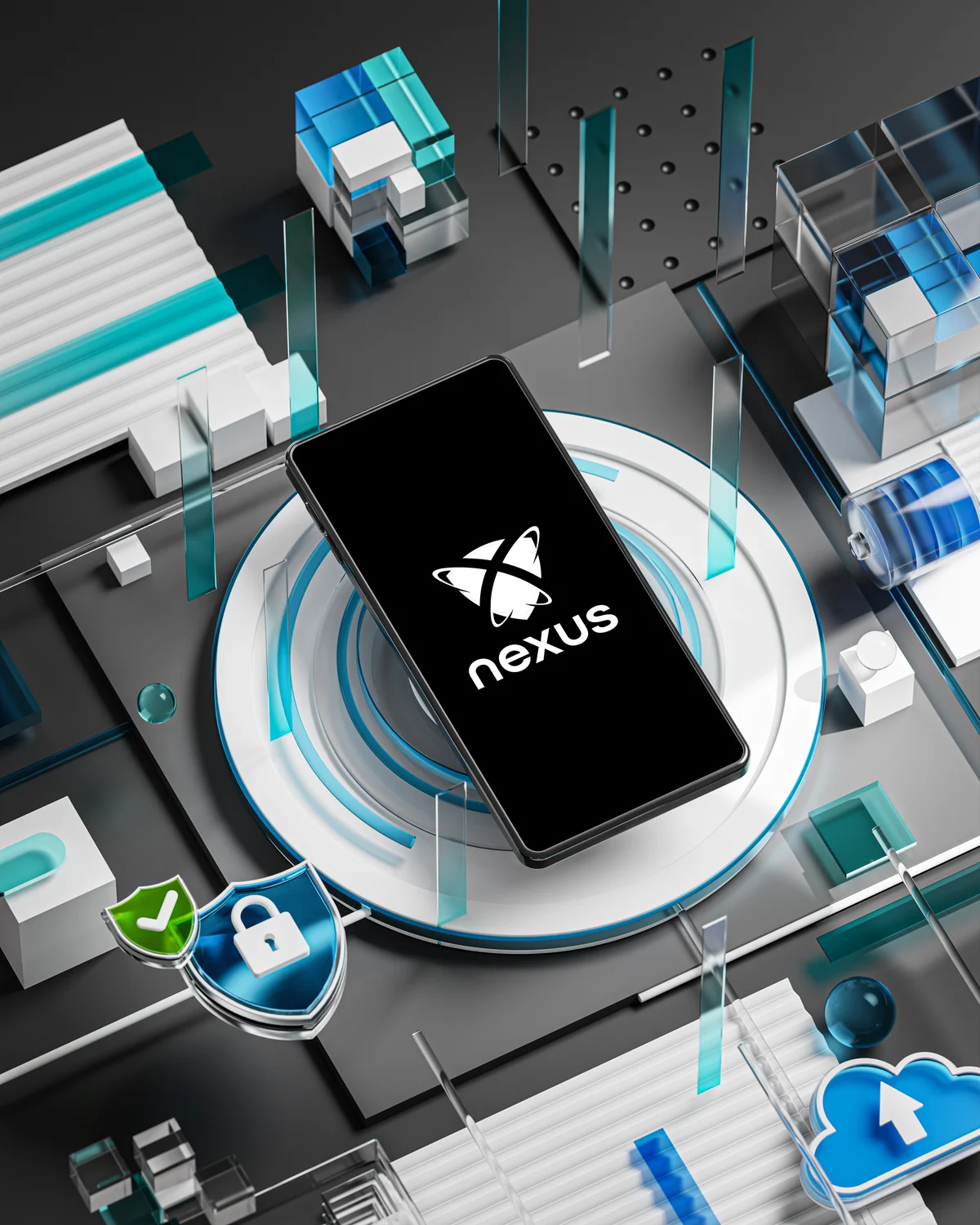
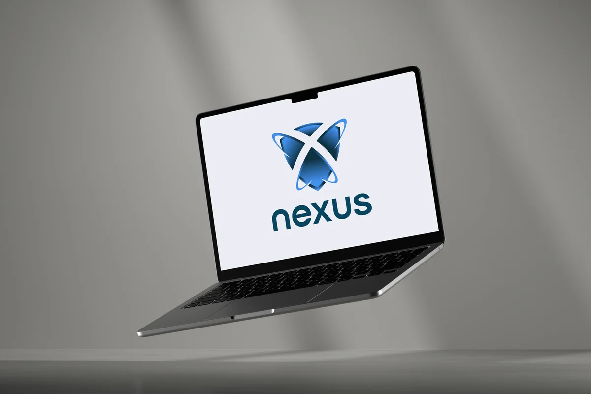
We developed a brand system anchored in the concept of connection and protection. The isotype and visual discourse reinforce solidity, reliable technology, and seamless integration. The color palette combines deep, trustworthy tones with vibrant accents that signal innovation. We created comprehensive brand guidelines, a messaging framework, and a visual system that flexes across digital and print touchpoints while maintaining coherence and trust.
The Outcome
The new brand gave Nexus a professional, unified presence that reflects their technical expertise and human-centered philosophy. The messaging framework helped their team articulate their collaborative methodology more effectively. The visual system scales across their growing service offerings — from custom development to technology consulting — while the clear hierarchy helps clients immediately recognize the quality and care behind every project.